|
 |
||||||||||||||||||||||||||||||||||||||||||||||||||||||||||
|
|
|||||||||||||||||||||||||||||||||||||||||||||||||||||||||||
|
HPshopping.com’s PC Navigation and
Configuration Experience:
In the past six months, hpshopping.com has significantly improved its PC product navigation and configuration for customers. The company achieved this by analyzing clickstream data, evaluating best practices, and acting on data gleaned from multiple users about the site's PC navigation and configuration tool. The result: increased configure-to-order (CTO) PC sales and 8% higher average CTO selling prices.*
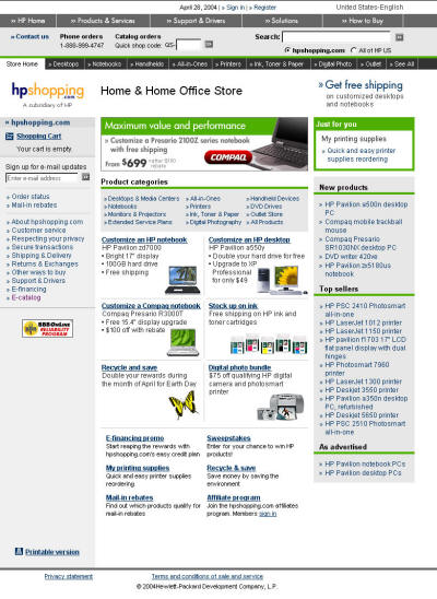
The "before" challenges
Before the makeover, hpshopping.com’s desktop and notebook series category pages were stacked vertically, one on top of the other. This display, while scalable (meaning viewers can view mulitple series by scrolling down the page) resulted in lengthy pages that made product comparisons arduous. Because the products were displayed vertically, customers were required to scroll up and down a page in order to compare two or more computers and to determine which qualifying offers applied to each.
Less technically savvy customers often found it difficult to select products based on their individual usage patterns or needs. When asked to decide whether they wanted to configure their own PC or purchase a ready-to-ship model, some felt they didn't have the enough information to make the decision. While the information adequately positioned the various series, customers required more details on benefits, specs, etc. in order to move forward.
Results of the redesign
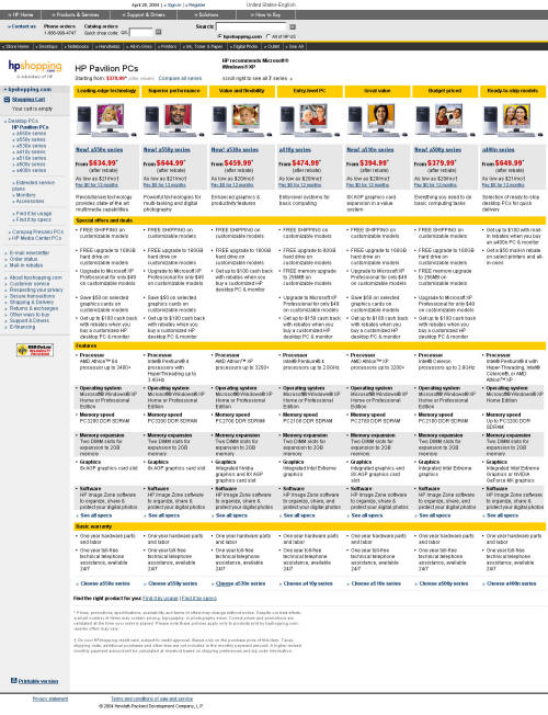
When hpshopping.com changed the design of its desktop and notebook PC category pages to a column layout, users found the horizontal organization (PCs are now side-by-side across the page) much more useful in comparing features and offers, and ultimately narrowing down their choices. Short series descriptors (e.g., "value” and “performance”) were added to help customers quickly differentiate each desktop or notebook series, and a needs-assessment chart was created to help those with less technical knowledge.
In addition, a new easy-to-understand series-description page was introduced, providing tabs with series overviews, specifications, warranty and support options. The overview tab highlights the main benefits of the series in a customer-focused style while the specs tab lists all the component options and available ranges.
Enhancing the Configurator
The old design
Prior to the makeover, hpshopping.com’s configurator listed all the series components and add-ons on one long page, with no clear separation between items, and placed component options and promotions in pull-down menus. While this approach was space-efficient, it didn’t make it easy for users to see all their options, realize the prices and promotions associated with each item, or understand the "step-up" benefits associated with upgrading to a higher model. It also was not an ideal model for providing complete information about add-ons such as printers and scanners.
While hpshopping.com did enable customers to view price adjustments associated with components and add-ons they selected before adding the final product(s) to their cart, customers had to do some searching to find the “Update price” button which was located at the bottom of the page.
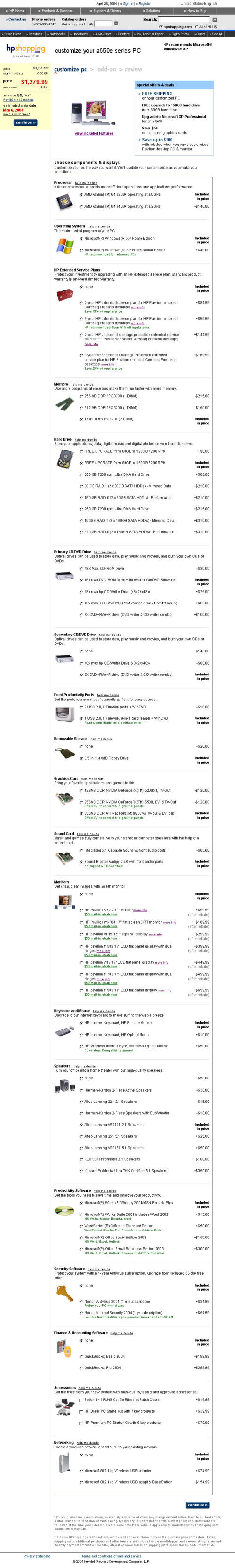
The new design
In order to make the process easier to understand and more convenient for customers, hpshopping.com.com made several significant changes to its configuration process.
First, hpshopping.com.com separated the PC components from the add-ons (creating a two-step configuration process) to better delineate the configurable options and the optional extras. At the same time, breadcrumbs were added to the top of the page to give users a reference point for their place in the configuration process.
Pull-down menus were replaced with a radio-button format, with clearer visibility into the trade-offs and price adjustments that each component selection will yield. Merchandising tags (such as “Recommended for students”) and promotions like mail-in rebates and discounts appear under qualifying components, making them more visible to customers.
One of the most noteworthy enhancements was the addition of an automatic price adjuster and ship date estimator tool, which is displayed in a box that remains in the customers’ line of vision on the left side of the screen, even as users scroll up and down the page. Total product prices and ship dates are automatically updated every time a user changes a configuration, adds a component, upgrades, etc.
In addition to adding the estimated ship date tool, customers can click the “Need a PC Sooner” link to learn about any shipping delays that may be caused by specific component choices. The link also informs customers of faster shipping alternatives.
Information about add-on products like printers and cameras was substantially improved by adding easy-to-understand product overviews, specifications, 3-D demos and “see it big” functionality.
Finally, hpshopping.com introduced a review option that allows customers to edit their component choices after selection, eliminating the need to reconfigure a solution from scratch.
* Average CTO price, taken four months before and after the redesign.
HPshopping.com -- 2001, 2002 & 2003 recipient of the “Best Computer Retailer Website” WebAward |
|